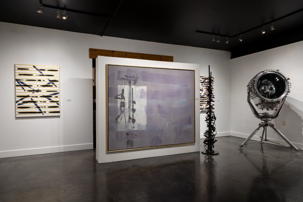
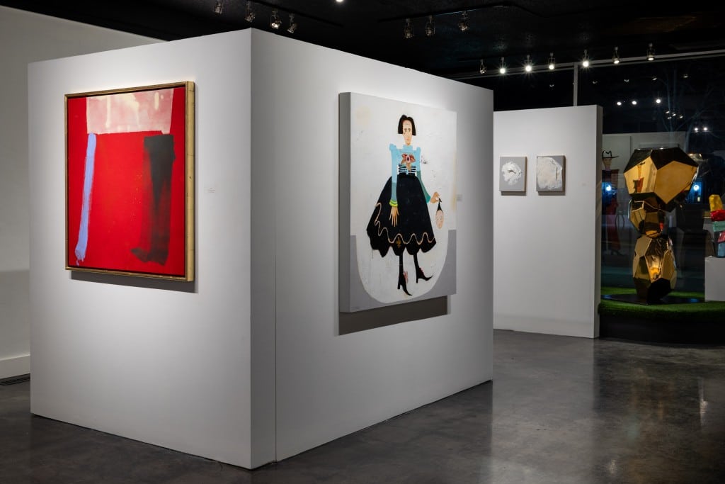
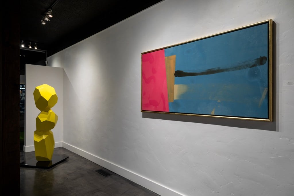
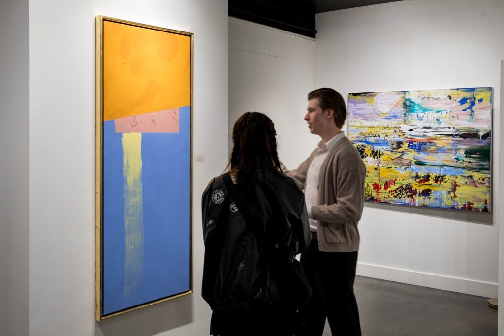
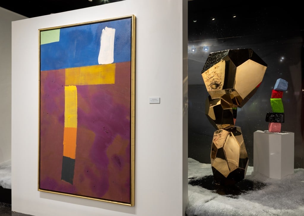
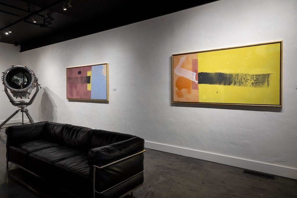
Phil Darrah, an Alberta based artist, has been exploring art since the 1950s, with a consistent focus on abstraction. In 2024, his commitment to expressing his connection with color, abstraction, and space is as strong as ever. It’s no surprise to see Phil featured in our current exhibition, “CHROMATIC ARRAYS,” which delves into the relationship between color and art.
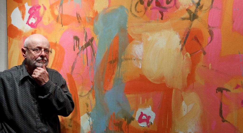
Check out our quick conversation with Phil conducted by our Gallerist, Louis Elmer, to get insights into his current artistic journey and background.
What direction do you feel that your work is headed in as we head into 2024? Is there anything you would like to experiment with specifically?
In regards to color, you have painted with a wide variety ranging from striking pinks, vibrant reds to earthy browns, and other more subdued darker tones. What have you enjoyed utilizing the most in your career? What combinations do you find yourself using/enjoying the most?
P: Colour. In general I find that living in a rural setting provides a constant array of light and colour change. This year, which is peculiar in that there is very little snow and the fields are subject to frost, there is an abundance of muted ochres. Sometimes my colour is in reaction to that of the landscape. Again as I work intuitively it is hard to predict.
What inspiration do you often find with the names of your paintings? Do you start a painting with a name and theme in mind, or does this come gradually with the completion of the work?
P: Titles for my paintings typically emerge after the artwork is completed. I retrieve the finished piece from the floor, affix it to the wall, and tape it to its exact cropped dimension and orientation, determining its top, etc. The choice to work on the floor allows me to delay deciding on the orientation. When selecting a title, I strive—though not always successfully—to find one that complements the painting and is memorable. Lately, the challenge lies in remembering these titles.
In your career as a Professor at the University of Alberta, you have taught quite a few artists and other creatively minded people, including represented artist Shawn Serfas. Do you have any fond memories of teaching him, and other students during your time?
P: I have many fond memories of teaching both painting, drawing and introductory courses at an undergraduate level and of course of teaching graduate students. It is very gratifying to see many of these continuing at various stages of their professions.
What was your impetus behind the use of Gold Leaf on your frames? Why have you stuck with this practice for so long?
P: Frames protect paintings, allow them to be stacked without endangering the edges or middle of the canvas, and they cover up the edge of the canvas, so that when hung and one approaches from the side, one is not consciously trying to ignore the edge of the canvas.
Also, I consider my work to be traditional painting and as such it needs some separation from it’s surroundings. I have the poplar stock milled to the profile I think suits the sort of paintings I do and I then gild the frame with imitation gold leaf. I don’t particularly like painted wood frames and despite the time consuming process of gilding feel it worth the investment of time. It is worth noting that on the few occasions that I have sent work out unframed, I have always regretted either the damage that resulted or the presentation. If a client were to purchase a work and then remove the frame,I would have no choice but to accept it.
As a gentleman of older age, do you feel that age has impacted your artistic process, philosophy, and creation of works? If so, where do you find this occurring?
P: Age. When I started out as a young graduate student in painting, I had little idea of what this might entail. I could count the number of professional and successful artists that I knew, on one hand. Gradually, over time I met, worked with and learned from, a number of significantly helpful individuals at varying stages in this journey. One needs help at all ages of one’s life but I suppose that by the time I was 60, I had figured out that this was my life and that getting on with it and perhaps narrowing the focus would help further.
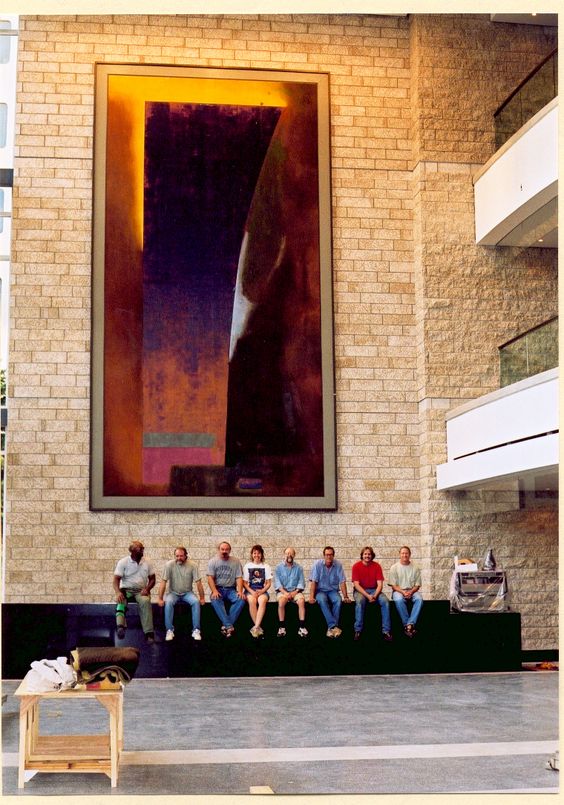
At the Francis Winspear Center, there is a massive piece named Calix that was painted by you in 1996. What can you tell us about this piece? What was it like working to create such a large work?
In many of your newer works, there is use of different mediums and materials, such as rocks and minerals which are often painted over. Why have you decided to choose this medium? What inspired you to do so?
P: I suppose I do from time to time use a variety of materials and aggregates in and with my paint. Most commonly plaster to give paint some body, it also takes gloss out of the surface , similarly sand and whatever detritus might be to hand. Often a particular color will change somewhat when mixed with gloss or matte and its surface may be more or less distinctive. If you think of paint as diction , dry, wet, smooth, rough, thick, thin all are qualifying aspects of the stuff painters work with.Paint is stuff and I want it to be seen as stuff as well.
Growing up in the Post-War modern era of art, were there any artists you took a liking to? Did you ever meet any famous artists that left an impression on you?
P: I was fortunate in that the school I attended from the age of 11 – 17 had an art teacher who maintained a professional art practice and that the provincial art school I subsequently attended, had several similarly committed artist/teachers who provided an early glimpse of a wider world of professional practice.
Later, when I was accepted for grad. school at The Slade, UCL , I was fortunate to have as my tutor, William Townsend. William Townsend was a practicing artist with amongst other things, a strong connection to the Banff Arts program in Alberta. He helped me as my tutor and later as an advisor. I continue to regard him and his achievements as a most remarkable man.
In 1968 when I arrived in Canada to teach at the Dept. of Art & Design, U.of A. there were many colleagues whose work and advice I benefited from. Chief among these was Douglas H. Haynes, aka Doug. There is no doubt that I learned the most about professional practice from Doug. I would be remiss if I failed to mention my wife and companion and fellow artist Isla Burns who is widely known for her steel sculpture and studio insight.
More broadly Picasso and Matisse have remained the most constant beacons and source of discovery throughout my professional painting life.
To view Phil’s works in person, come visit our current running exhibition: “CHROMATIC ARRAYS” running until the end of this January. 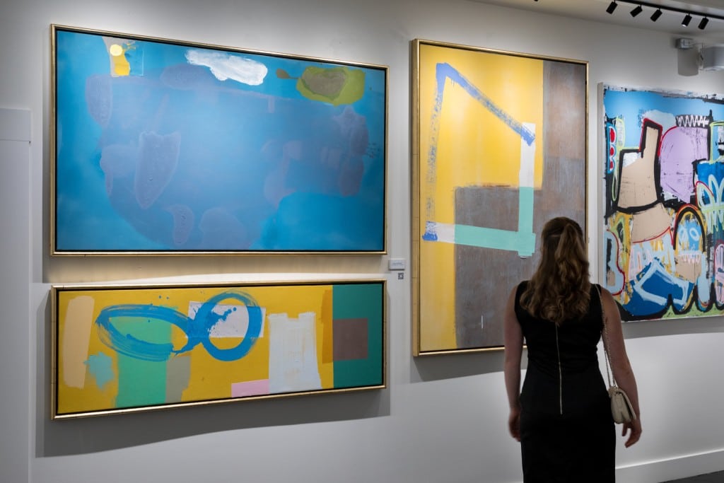
January 12, 2024